Your website logo is the visual cornerstone of your digital presence. So, website logo design is extremely important. It is often the very first element visitors notice when landing on your site, establishing brand identity, building authority, and signaling what your business stands for in seconds.
However, creating an effective website logo requires more than choosing a nice font and picking vibrant colors. In modern web design, your logo must function as a versatile visual system—rendering crisply on everything from a 16-pixel browser tab to a 4K desktop monitor without slowing down your site’s load speed.
This comprehensive guide walks you through planning, designing, optimizing, and deploying a high-impact website logo that elevates your brand and aligns with technical web standards.
Key Takeaways: Website Logo Design
- Define Your Brand First: Establish your target audience, positioning, and visual personality before touching any design tools.
- Build a Responsive System: Create horizontal, stacked, and icon-only variations so your logo fits seamlessly across all screen sizes and layouts.
- Prioritize Technical SEO: Use SVG vector formats, descriptive file names, and proper alt text to maintain fast Core Web Vitals scores and accessibility.
- Deploy a Complete Favicon Package: Go beyond standard
favicon.icofiles by providing high-res PNG icons for mobile devices and SVG favicons for dark mode compatibility.
Step 1: Define Your Brand Strategy Before Designing
Before opening graphic software or exploring AI logo generators, establish a clear foundation for your business identity.
1. Clarify Audience, Positioning, and Personality
- Target Audience: Identify demographic traits, pain points, and preferences of your ideal customers. A corporate B2B brand requires clean, authoritative visuals, whereas a youth consumer brand can embrace energetic typography and bold colors.
- Brand Positioning: Determine your Unique Value Proposition (UVP). What sets your product or service apart from direct competitors?
- Brand Personality: Select 3 to 5 core traits (e.g., innovative, reliable, playful, minimalist). These traits guide visual choices such as color temperature, font weight, and graphic style.
2. Choose a Memorable Name and Tagline
- Keep your brand name concise, easy to pronounce, and effortless to spell.
- Taglines should be brief (3 to 6 words max) and complement the brand name without cluttering the logo mark.
- Avoid ultra-fine text on taglines; small tagline text often becomes unreadable on smaller mobile screens.
Step 2: Select the Right Logo Style for Your Site
Choosing the correct structural style depends on your brand equity, name length, and target placements.
| Logo Style | Definition | Best Used For | Examples |
| Wordmark | Full brand name written in custom typography. | Short, distinctive brand names (1–2 words). | Google, Coca-Cola, Visa |
| Lettermark | Monogram or acronym constructed from initials. | Long or multi-word business names (3+ words). | IBM, NASA, HBO |
| Icon / Symbol | Standalone visual mark or abstract icon. | Established brands; app icons, social avatars. | Apple, Nike Swoosh, Target |
| Combination Mark | Text paired alongside or above an icon. | New businesses building initial brand recognition. | Adidas, Target, Mastercard |
Pro Tip: New brands benefit most from a combination mark. Once market awareness grows, you can isolate the standalone icon for app shortcuts, social profiles, and browser favicons.
Step 3: Build a Responsive Visual System
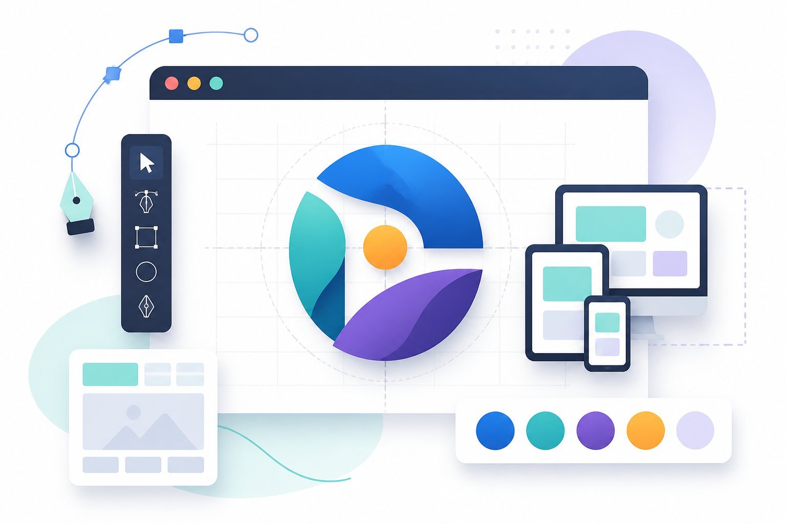
A successful website logo is an adaptable visual system rather than a single static picture.
1. Strategic Color Palette
- Limit the Palette: Restrict primary logo colors to 2 or 3 shades max to maintain high recognition and avoid visual visual noise.
- Color Psychology Signals:
- Blue: Trust, security, professional dependability.
- Red/Orange: High energy, urgency, excitement.
- Green: Health, growth, sustainability.
- Solid Color Fallbacks: Avoid depending exclusively on gradients. Gradients often degrade in single-color printing or small mobile icons. Always create a solid black and solid white fallback version.
2. Typography & Readability
- Kerning & Contrast: Select clean-lined, high-legibility fonts with sufficient character spacing (kerning) so letters do not blur together on small screens.
- Font Count: Use a maximum of two fonts—one primary font for the brand name and one simple secondary font for optional taglines.
3. Layout Variations for Digital Placement
Design three layout orientations to fit modern responsive website templates:
- Horizontal Layout: Logo mark to the left of the brand name (Ideal for desktop website headers).
- Stacked Layout: Logo mark centered above the brand name (Ideal for mobile headers, business cards, and vertical footers).
- Icon-Only Mark: Standalone symbol with text removed (Ideal for favicons, app icons, and social media profile pictures).
Step 4: Technical SEO & Favicon Optimization
Your logo file setup directly affects page loading speed, search engine indexation, and user accessibility.
[ Primary Master File (.AI / .EPS / .PDF) ]
                      │
        ┌─────────────┴─────────────┐
        ▼                           ▼
[ Web Header (.SVG) ]     [ Web Graphics (.PNG / .WebP) ]
        │                           │
  - Scalable Vector           - Lossless Transparency
  - Small File Weight         - Social Media Cards
  - Crisp on Retina           - Email Signatures
1. Web File Formats
- SVG (Scalable Vector Graphics): The industry standard for website headers. SVG files scale infinitely without pixelation, maintain tiny file sizes, and reduce server load.
- PNG: Essential for digital uses requiring transparent backgrounds when SVG is unsupported (e.g., social media banners, email signatures).
- WebP: Modern raster format offering superior compression for web image assets.
- AI / EPS / PDF: Master vector files kept on record for professional printing and future vector editing.
2. Image SEO Markup
Optimize your website header logo for search engine crawlers:
- Descriptive File Naming: Rename generic files like
logo.pngto branded, keyword-rich names such asbrandname-official-logo.svg. - Accessible Alt Text: Add descriptive alt text indicating the brand name and context:HTML
<a href="/" title="BrandName Home"> <img src="brandname-official-logo.svg" alt="BrandName Official Logo" width="180" height="40" /> </a> - Explicit Dimensions: Always set
widthandheightattributes to prevent Cumulative Layout Shift (CLS) issues during page load.
3. Modern Favicon Setup
A standard 16×16 pixel icon is no longer sufficient for modern cross-device browsing. Deploy a full favicon asset suite:
favicon.ico(16×16 / 32×32): For legacy desktop browser tabs.favicon.svg: For modern browsers, supporting dynamic color switching in Dark Mode.apple-touch-icon.png(180×180): For iOS home screen bookmarks.android-chrome-192x192.png&512x512.png: For Android home screen shortcuts and Progressive Web Apps (PWAs).
Step 5: Commercial Licensing & Brand Assets
Before publishing your design, ensure complete legal ownership and document brand guidelines.
- Commercial Licensing: Verify that all fonts, stock shapes, or design templates carry full commercial distribution rights. Basic or free tiers of online logo tools often restrict commercial use or withhold vector master files.
- AI Copyright Considerations: If utilizing AI logo generators during brainstorming, note that pure AI-generated artwork may face copyright limitations in certain jurisdictions unless customized or redrawn by human hand.
- Brand Asset Kit: Package your SVG, PNG, and master vector files alongside a simple brand style sheet listing your hex color codes, font names, and spacing rules for consistent multi-channel marketing.

Frequently Asked Questions
What is the best file format for a website logo?
SVG (Scalable Vector Graphics) is the best file format for website logos. SVGs load fast, never blur on Retina displays, and feature tiny file sizes that keep site speeds optimal.
What size should a website header logo be?
Desktop header logos typically range from 250px to 400px wide by 60px to 100px tall, auto-scaling down to roughly 120px to 180px wide on mobile screens.
How do I make my logo look crisp on mobile devices?
Use vector SVG files or upload high-resolution 2x PNG assets (double the display dimensions) paired with CSS responsiveness rules to ensure crisp rendering on high-DPI displays.
What makes a Website Logo Design effective and memorable?
Honestly, a great logo just kind of clicks—it’s simple enough that you can spot it right away, even when it’s shrunk down to the size of a thumbtack on your phone screen. Ever noticed how some logos still pop as tiny profile pics? That’s no accident.
And here’s something people sometimes forget: your logo should hold up in black and white, not just in color. If it still looks sharp and recognizable without any color at all, you’re probably on the right track. It’s one of those little tests that can save you a headache when you need to print, embroider, or stamp your logo somewhere unexpected.
Oh, and consistency? That’s huge. If you’re swapping out logos, fonts, or colors all over the place—on your site, socials, business cards—it just gets confusing. Stick to the same look across everything, and folks will start to recognize your brand way faster. It’s almost like training people’s brains, in a good way.
Glossary: 20 Key Terms
- Brand Identity – The visible elements of a brand, like color, design, and logo, that identify and distinguish the brand in consumers’ minds.
- Wordmark – A logo made entirely of stylized text, usually the business name.
- Lettermark – A logo made from the initials of a business name.
- Icon – A simple graphic symbol representing a brand or concept.
- Combination Mark – A logo that combines text and an icon or symbol.
- Favicon – The small icon that appears in a browser tab next to the website title.
- Color Palette – The collection of colors chosen for a brand’s visual identity.
- Typography – The style, arrangement, and appearance of text.
- Scalability – The ability of a logo to look good at any size, from tiny icons to large banners.
- Contrast – The difference between elements, often in color or brightness, to make designs stand out.
- Mockup – A realistic preview showing how a logo or design will look in real life.
- Custom Website Logo Design – A logo created specifically for a business, not from a template.
- Template – A pre-made design layout that can be customized.
- AI Logo Generator – Software that uses artificial intelligence to create logo options based on user input.
- Tagline – A short phrase that sums up a brand’s promise or vibe.
- Visual System – The set of design rules and assets (colors, fonts, layouts) that create a consistent brand look.
- Brand Personality – The set of human traits attributed to a brand.
- Positioning – How a brand is perceived in relation to competitors.
- Layout Variation – Different arrangements of logo elements for different uses.
- Rights – Legal permissions to use and modify a logo or design.