Designing your first website can feel pretty overwhelming at first glance, but honestly, it doesn’t have to be. For beginners, the smartest way to approach web design is to start by figuring out your goals, then use a straightforward website builder to whip up a clean, simple layout with easy-to-read content. Good news: you don’t need to be a coding wizard to pull off a sharp, professional-looking site. Just learn how to design a website for beginners.
Every solid website starts with some planning. Before you get lost picking colors or fancy fonts, you’ve got to know what your site is for—and who’s actually going to visit it. Once you’re clear on that, choosing a platform, setting up your layout, and writing the content just feels a lot less stressful.
This guide breaks down each step to design a website for beginners. You’ll see how to plan your site, pick the right tools, organize your pages, and write content that actually builds trust. By the time you’re through, you’ll have a much clearer idea of how to launch your first website without second-guessing every move.
Pro Tip: Keep your first design super simple. You can always add more pages, features, or fancier design bits after you launch. Figure out what your visitors want before you get too wild with extras.
Key Takeaways: How To Design A Website For Beginners
- Having a clear plan and specific goals makes every part of building your site way easier.
- Choosing the right platform, domain, and hosting from the start gives your site a strong foundation.
- Simple layouts, consistent design, and content that feels trustworthy turn more visitors into customers—or fans, or whatever you’re after.
Set Goals and Plan the Site

Before you even open up a website builder, you’ve got to have a plan how to design a website for beginners. Figure out who your site is for, what kind of site you’re making, how your pages will fit together, and roughly what you want each page to look like.
Define Your Target Audience and Primary Action
Start by asking: who’s actually going to visit this site? Think about their age, where they live, what they care about, and what problem they’re hoping you’ll solve.
Once you’ve got your audience in mind, decide what you want them to do when they land on your site. That’s your “call to action” (or CTA, if you want to sound fancy). Maybe it’s buying something, filling out a form, or just signing up for your newsletter.
Every page should help push visitors toward that main goal. If your CTA is “schedule a consultation,” then your homepage, about page, and services page should all nudge people toward clicking that button.
Seriously—write down your audience and your CTA before you go any further. It’ll keep your website goals focused as you build everything else out.
Choose the Right Type of Website
The type of site you make depends on your main goal. If you want to share info and build an audience over time, a blog is perfect.
Launching a single product or offer? Go with a landing page—one clear CTA, no distractions.
If you’re selling stuff directly (physical or digital), you’ll need an online store or ecommerce website with product pages, a shopping cart, and a secure checkout.
Here’s a quick cheat sheet:
| Site Type | Best For |
|---|---|
| Blog | Sharing content, building authority |
| Landing Page | Single offer, product launch |
| Online Store | Selling products directly |
| Business Site | Services, local companies |
Pick the type that fits your main goal—not just the one that looks the fanciest.
Create a Sitemap and Page Priorities
A sitemap is basically a list of every page your site will have, plus how they’ll connect. It’s your site structure (or site architecture, if you like buzzwords).
Start with your homepage—it’s where most people will land. Then list out the other pages you need, like about, contact page, FAQ page, or testimonials page.
Group similar pages together. For example, if you’ve got a bunch of products, tuck them all under a “Shop” section instead of cluttering your main menu.
Not every page is equally important. Rank them:
- High priority: Homepage, product/service pages, contact page
- Medium priority: About page, blog, testimonials
- Low priority: Terms of service, privacy policy
This makes it easier to decide what goes in your main navigation menu, and what can be hidden away in the footer.
Pro Tip: Keep your main navigation to 5–7 links, max. Too many options just confuse people and make your site structure messy.
Sketch a Simple Wireframe
A wireframe is just a rough sketch of each page before you bother with colors, images, or polished text. You can doodle this on paper or use a free online tool—whatever’s easiest.
Don’t worry about to design a website for beginners. Just mark where your header, navigation, main content, and footer will go.
For your homepage, sketch out where your headline, CTA button, and any featured products or testimonials will sit. For product or blog pages, block out spots for images, headlines, and the main text.
Wireframes should be basic—boxes and scribbled labels are totally fine. This step saves you a ton of headaches later, since you’ll already know your layout before you start dragging things around in your builder.
Choose a Platform, Domain, and Hosting
Every website needs three basics: a platform to build it, a domain name so people can find it, and hosting to keep it online. Get these three sorted early and you’ll save yourself a lot of hassle down the road.
Compare Website Builders, CMSs, and Custom Code
You’ve got three main ways to build a website. A website builder like Wix or Squarespace gives you drag-and-drop tools and built-in hosting, so you can go from idea to live site in a day, sometimes less. A content management system (CMS) like WordPress gives you more flexibility and tons of plugins, but you’ll need a bit more patience to set it up. If you want total control, you can write your own HTML, CSS, and JavaScript—but that’s only fun if you actually like coding.
Here’s a quick look at the options:
| Option | Best For | Skill Level |
|---|---|---|
| Website builder (Wix, Weebly, Webflow) | Beginners who want speed | None to low |
| CMS (WordPress) | Bloggers, growing sites | Low to medium |
| Shopify | Online stores | Low to medium |
| Custom code | Unique or complex sites | High |
For most newbies, a free website builder or a cheap plan is the easiest way to build a website without hiring a pro.
Select a Domain Name and Hosting Plan
Your domain name is your site’s address—like yourbusiness.com. Keep it short, easy to spell, and skip weird numbers or dashes. Domain registration usually runs $10–$20 a year, though some website platforms throw in a custom domain for free the first year.
Web hosting is what keeps your site online for visitors. If you’re using Wix or Squarespace, hosting’s already baked into your plan. If you go with WordPress, you’ll need to buy a separate hosting plan from somewhere like Bluehost or SiteGround.
Pro tip: If you can, buy your domain and hosting from the same company. It just makes setup—and dealing with support—a lot easier.
Pick a Template That Fits Your Purpose
Templates give you a ready-made layout so you’re not staring at a blank screen. Website templates depend on the platform, but most fall into categories like business, blog, portfolio, or store.
Look for a template that fits your site’s goal. A photographer? Go for big image galleries. Restaurant? Make sure there’s a menu section and (ideally) online ordering.
Popular tools like Divi offer flexible, drag-and-drop templates for WordPress, while Wix and Squarespace have their own massive libraries. Once you pick a website template, think of it as a starting point—not the final product. Change up the colors, fonts, and images so your site doesn’t look like a cookie-cutter clone.
Build a Clear Page Layout and Navigation
A website needs a layout that guides visitors to the info they want—without making them think too hard. Good structure means solid visual hierarchy, simple navigation, and a design that works on any screen (phone, tablet, laptop, you name it).
Use Visual Hierarchy to Guide Visitors
Visual hierarchy is just a fancy way of saying: make the important stuff stand out. Use size, color, and spacing to draw attention where you want it.
Your headline? Make it the biggest thing on the page. Your call to action button? Give it a bold color that pops against the background.
Alignment matters, too. Keep your text and images lined up on a grid so everything looks organized, not like a random pile.
Group related things together, leave space between sections that aren’t connected. That “white space” helps people scan and understand your site faster. Following basic web design principles like these to design a website for beginners keeps your site clean and easy to use—even for total newbies.
Create Consistent Navigation and Page Structure
Your navigation menu should always be in the same spot—usually right at the top. That way, people don’t have to relearn your site every time they click a new page.
Stick to five to seven links in your main menu. Use clear, boring labels like “About,” “Services,” and “Contact”—skip the clever stuff, at least for now.
Your homepage should link clearly to your most important pages. And definitely put a contact form or CTA near the top—don’t make people hunt for it.
A classic layout structure has a header, navigation bar, main content, and footer. Most people expect this, so don’t reinvent the wheel unless you’ve got a really good reason.
Pro Tip: Test your navigation menu on a friend or family member who’s never seen your site. If they can’t find your contact page in a few seconds, it’s time to make those menu labels clearer or trim down the options.
Design Responsive Layouts From the Start
Responsive design just means your layout adapts on its own, depending on the screen size. This really matters—over half of web traffic these days comes from phones and tablets, not desktops.
Try using flexible grids and images that scale, instead of locking everything down with fixed pixel widths. That way, your layout can stretch or shrink as needed, and you won’t end up with something that’s broken on certain devices.
For example, a three-column layout might look great on a big desktop monitor, but on a phone? Not so much. That’s where CSS media queries come in—you can tell your site to collapse into a single column when the screen gets smaller.
Optimizing for mobile isn’t just about layout, either. It affects how fast your site loads and how easy it is to tap buttons. Nobody likes trying to tap a tiny link with their thumb and missing three times.
Honestly, responsive web design is one of the biggest things you can do to improve both your site’s look and the overall experience. People expect things to just work, no matter what device they’re using.
Create a Cohesive Visual Style
Your site’s visual style is what ties everything together. Colors, fonts, images—they should all work together to build a brand that feels consistent and recognizable.
Choose an Accessible Color Palette
Color sets the whole vibe for your site. Pick two or three main colors that fit your brand, then toss in some neutrals for backgrounds and text.
Even just learning a little color theory helps a lot. You want colors that play nicely together—not a bunch that clash and make your eyes hurt.
Contrast is just as important as the colors themselves. If your text doesn’t stand out from the background, people (especially those with vision issues) are going to struggle to read it.
If you’re not sure, stick with the classic: dark text on a light background, or the other way around. And before you lock in your color scheme, check it with a contrast tool—don’t just guess.
Pro Tip: Try looking at your color palette in grayscale. If you can still read all the text, your contrast is probably good enough for almost everyone.
Use Typography for Readability
Typography isn’t just about looking fancy—it makes a huge difference in how easy your content is to read. Honestly, two fonts is plenty: one for headings, one for everything else.
Set up a clear hierarchy so people can skim. Headings should be bigger and bolder, and each level (H1, H2, etc.) should shrink in a predictable pattern as you go down.
Font size matters, too. For body text, 16px is the bare minimum if you want people to read comfortably on most screens.
Don’t go wild with different font weights or styles on a single page. Clean and readable always beats decorative fonts that slow everyone down.
And line spacing? Give your text some breathing room—usually about 1.5 times the font size works well.
Add a Logo, Images, and Brand Assets
Your logo is usually the first thing people see. Keep it simple, put it in the same spot on every page, and make sure it looks good on both light and dark backgrounds.
Even if you don’t have design experience, free tools like Canva to design a website for beginners can help you whip up a logo. If you want more control, Figma or Sketch are great for custom graphics.
High-quality images make your site feel legit. Blurry or pixelated photos? That just screams unprofessional, so stick with sharp, well-lit images that fit your brand’s vibe.
No good photos of your own? Free stock photo sites like Unsplash and Pixabay have tons of options.
And don’t skip alt text for images! It helps people using screen readers and boosts your site’s accessibility. Plus, it’s just good practice.
Write Content That Builds Trust and Drives Action
Website content isn’t just there to fill up space. It should answer your visitors’ questions, help them make decisions, and show them you’re actually a real, trustworthy business.
Focus Each Page on a Visitor Need
Every single page should solve a problem for your target audience. Before you write anything, think: what does someone want to know when they land here?
Your homepage should spell out what you do and who you help. Contact pages? Make it super simple to reach you. Product pages? Answer stuff like size, price, and shipping—don’t make people hunt for the basics.
Quality content keeps things focused. If you try to do too much on one page, you just end up confusing people and hurting the user experience.
If you’re running a blog, stick to one main topic or question per post. It’s easier for readers to follow, and they can actually find what they’re looking for.
Make Calls to Action Specific and Visible
A call to action (CTA) tells visitors what to do next. “Click here” isn’t helpful—be specific about what happens if they click.
Use action words that actually describe the result:
- “Get your free quote”
- “Start your 14-day trial”
- “Shop new arrivals”
- “Book a consultation”
Put your CTA somewhere obvious—don’t make people scroll forever to find it. And make those buttons pop with color and clear text.
If you’re trying to grow your email marketing list, keep your signup form short and the benefit obvious. Nobody wants to fill out a huge form just to get a newsletter.
Pro Tip: Only test one CTA at a time. Tweaking button color, text, or where it sits can make a big difference, but if you change everything at once, you’ll never know what worked.
Use Social Proof and Useful Supporting Content
Let’s be real—people trust other people more than ads. Testimonials from real customers show new visitors that others have had a good experience with you.
Got several great reviews? Make a testimonials page. Or sprinkle shorter quotes on your homepage or product pages—it all helps.
A contact form that’s easy to find and fill out builds trust, too. It shows you’re around and ready to answer questions.
Other trust-boosting content includes:
| Content Type | Purpose |
|---|---|
| Case studies | Show real results |
| FAQs | Answer common concerns |
| Blog posts | Demonstrate knowledge |
| Photos or videos | Prove authenticity |
Just keep everything accurate and up to date. Outdated info or broken links? That’s a quick way to lose trust.
Test, Optimize, and Launch Your Website
Before you hit “publish,” make sure your site actually works the way it should. That means checking for accessibility, making sure it loads quickly, and making it easy for search engines to find. A bit of testing now saves a lot of headaches later.
Check Accessibility, Mobile Usability, and Browser Compatibility
Your site needs to work for everyone—including people using screen readers or those with vision challenges. Add alt text to every image so screen readers can describe them, and double-check that your text stands out from the background.
Don’t forget mobile! More than half of all web visits are from phones. Test your responsive web design on different screen sizes to make sure text, buttons, and images all resize the way they should to design a website for beginners.
And please, check your site in more than just Chrome. Try Firefox, Safari, maybe even Edge. Sometimes little browser quirks can break layouts or buttons.
If you use scroll animations, test them on slower devices, too. Nothing’s worse than a laggy animation that just freezes up and ruins the experience.
Apply Essential SEO Before Publishing
SEO helps people actually find your site in search results. Before launch, give every page a clear title and meta description—these tell Google and Bing what your page is about.
Structure your content with one main heading per page, plus clear subheadings. This helps both search engines and real people scan your pages.
Set up a simple sitemap and submit it to Google Search Console. It helps search engines index your pages faster, which is always a good thing.
If SEO feels overwhelming, you’re not alone. Lots of businesses hire pros to handle tricky stuff like site speed, keyword research, and link building. If you’re new, it might be worth it to save time (and frustration).
Pro Tip: Before launch, run your site through Google’s Mobile-Friendly Test and PageSpeed Insights. They’re both free and will show you exactly what needs fixing before real visitors show up.
Measure Results and Improve After Launch
Launching your website isn’t the finish line—it’s more like the starting gun. Set up Google Analytics to see who’s visiting, what they’re looking at, and how long they stick around to design a website for beginners.
Keep an eye on site speed, too. Slow pages chase people away and can tank your search rankings.
Check your analytics every month. If you see pages with high bounce rates or barely any traffic, tweak the content or design and see if things improve.
And honestly, just ask a few friends or customers for feedback. Sometimes a fresh set of eyes will spot problems you totally missed.
Frequently Asked Questions
People starting out with web design usually have a lot of questions—about tools, skills, timelines, you name it. Here are some straightforward answers to the things beginners ask most often.
Can I design a website myself?
Absolutely. You don’t need to hire a pro to get a website up and running. Website builders and templates make it pretty easy for beginners to design a site, even if you don’t know a single line of code.
If your project is simple—a personal blog, a small business site—you can probably handle it solo. If you want fancy features or something custom, you might bring in a pro down the road.
How do I start web design as a beginner?
Start by figuring out what you want your site to do. Who’s your audience? What do you want people to do when they visit? Get clear on that before you even open a design tool.
Then, pick a platform or website builder that matches your comfort level. Sketch out your main pages and how they connect—just a simple site map is fine.
Pro Tip: Before you dive into any design software, jot down the top three actions you want visitors to take. It’ll help keep your layout focused on results, not just looks.
What are the main steps to designing a website?
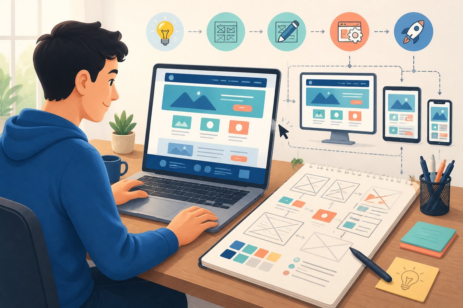
Most web design projects follow a similar path to design a website for beginners, from idea to launch. The full design process usually looks like this:
- Plan your site goals and audience
- Choose a platform or builder
- Map out your site structure
- Design page layouts
- Add content and images
- Test the site on different devices
- Launch the site
- Monitor performance and make updates
If you skip steps—especially testing—you’re almost guaranteed to run into problems after launch.
How can I create a website for free?
You can totally build a website for free using platforms that offer no-cost plans and templates. Just know there are usually some limits, like having a platform-branded domain or fewer design options.
If you want your own domain and more control, you’ll probably need to pay. But starting free is a good way to test your idea before investing. There are plenty of guides on how to build a website from scratch with both free and paid tools.
Do I need to know HTML to design a website?
Honestly? Not really. These days, you can put together a pretty slick website without ever touching a line of HTML. Most website builders out there—think Wix, Squarespace, or whatever’s trending—let you just drag and drop stuff where you want it. No coding, no problem.
Still, knowing the basics of HTML, CSS, and JavaScript can be a lifesaver. Maybe you want to tweak something that’s just not possible with the builder, or you’re curious about what’s actually happening under the hood. HTML’s what gives your page its bones, and CSS is what makes it look good—colors, fonts, all that. JavaScript? Well, that’s for the fancy stuff. You don’t have to be an expert, but a little know-how can go a long way.
What are the essential rules of good web design?
Honestly, good web design isn’t just about making things look pretty—it’s about how people actually use your site. There are a handful of core rules that almost every website should stick to, and they’re mostly about the user’s experience.
- Navigation should be simple—if people get lost, they’ll just leave
- Stick to a consistent layout; jumping around from page to page shouldn’t feel like entering a new website every time
- Your site needs to work smoothly on mobile (because, let’s face it, everyone’s on their phones now)
- Fast page load times matter—a slow site is just asking visitors to bail
- Use white space! Cramming everything together makes it stressful to look at
- Buttons and links should be obvious and easy to click (no hunting around, please)
If you stick to these basic design practices, you’ll probably notice people stay on your site longer and find what they’re after without too much hassle.
Comprehensive Key Terms Glossary
- HTML: The markup language that forms the basic structure of web pages.
- CSS: A stylesheet language used to style and format the appearance of web content.
- JavaScript: A programming language that adds interactivity and dynamic features to websites.
- Drag-and-drop tools: Website builder features that let you design by moving elements visually, without coding.
- Website Builder: An online tool (like Wix or Squarespace) that lets you create websites without coding, usually with drag-and-drop features.
- CMS (Content Management System): Software (like WordPress) for managing website content, offering more flexibility and plugins than most builders.
- Domain Name: Your website’s address on the internet (e.g., mysite.com).
- Hosting: The service that stores your website’s files and makes them accessible online.
- Wireframe: A basic sketch or outline of a website’s layout, used to plan structure before adding design elements.
- CTA (Call to Action): The main action you want visitors to take (like “Buy Now” or “Contact Us”).
- Sitemap: An outline showing all the pages on your website and how they connect.
- Visual Hierarchy: The arrangement of design elements to show importance and guide attention.
- Template: A pre-designed webpage or set of pages you can customize for your own site.
- Site Structure (Site Architecture): How your website’s pages are organized and linked together.
- Navigation: The menus and links that help users move around your site.
- Consistent layout: Keeping the structure and style similar across all your pages.
- Mobile-friendly: Making sure your site looks and works well on smartphones and tablets.
- Page load times: How quickly your website appears when someone visits.
- White space: Empty space on a page that helps separate content and avoid clutter.
- Buttons and links: Clickable elements that guide users to other pages or actions.
- Responsive Design: A web design approach that makes layouts adapt automatically to different screen sizes and devices.
- Flexible Grid: A layout structure that uses relative units (like percentages) instead of fixed pixels, so elements resize smoothly.
- CSS Media Queries: CSS rules that apply styles based on device characteristics like screen width, enabling responsive layouts.
- Contrast Checker: A tool that tests if your color combinations are readable for people with visual impairments.
- Typography Hierarchy: The arrangement of font sizes and styles to guide the reader’s eye and clarify content structure.
- Alt Text: Descriptive text added to images for screen readers and accessibility.
- Call to Action (CTA): A prompt (usually a button or link) that tells users what to do next, like “Sign up” or “Shop now.”
- Social Proof: Content like testimonials or reviews that shows others have had positive experiences with your business.
- SEO (Search Engine Optimization): Techniques used to make your website easier to find in search engines.
- Sitemap: A file or page that lists all the pages on your website, helping search engines crawl and index your content.
- Google Analytics: A free tool from Google for tracking and analyzing website traffic and visitor behavior.
- Bounce Rate: The percentage of visitors who leave your site after viewing only one page.
- Website Builder: An online tool or platform that lets you create websites without coding.