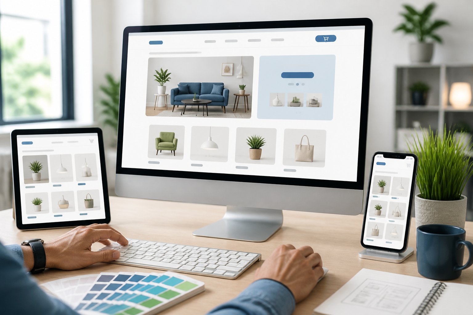
Let’s be honest, a good Shopify website design is about a lot more than just looking pretty. It’s about nudging visitors toward buying—using a clear layout, fast load times, and navigation that’s actually simple to use. Every little choice, from your theme to how your product pages are laid out, plays a part in whether someone sticks around or bounces.
You really don’t need to be a designer or a coder to pull off a store that gets results. Shopify’s got tools for days to help you build an ecommerce site that looks the part and actually works, as long as you take the time to plan things out. This guide will walk you through it all, step by step—from picking your theme to setting up navigation that keeps people moving toward checkout (instead of getting lost).
Pro Tip: Don’t underestimate the small stuff. Sometimes, swapping in clearer buttons or trimming down the checkout steps can boost conversions more than a full-blown redesign. You’ll see tips like this throughout—real changes that don’t waste your time or money.
Key Takeaways: Shopify Website Design
- A solid Shopify store starts with a game plan, not just picking a theme and hoping for the best.
- Your homepage, product pages, and navigation all need to work together to help shoppers make choices.
- It’s often the little tweaks—like building trust or smoothing out the design—that drive more sales than a total overhaul.
Build the Strategy Before Choosing a Theme

Jumping into themes before you know what you’re doing is like buying a car before you even know how many seats you need. You need a real strategy: who you’re selling to, what your brand stands for, and how customers are supposed to move through your store.
Define Your Audience, Offer, and Primary Conversion Goal
Before you touch a single design tool, jot down who your customer actually is. Are they bargain hunters? Are they after the fancy stuff? This shapes every single design choice you’ll make.
Your offer matters too. If you’re selling one hero product, your store’s going to look totally different from a shop with hundreds of SKUs spread across categories.
And what’s your main goal? Are you after first-time purchases, email signups, or are you trying to get repeat buyers? This changes what you put front and center and how you lay out your product pages.
Pro tip: Try to sum up your audience, offer, and goal in a single sentence. If you can’t do that, you probably need to tighten up your strategy before moving on.
Establish a Cohesive Brand Identity
Your brand identity is so much more than just a logo and a couple colors. It’s your tone of voice, your photography style, and honestly, just the vibe people get when they land on your site.
The best Shopify stores treat brand identity as a living, breathing system—not a box to check once and forget. That means your fonts, colors, and imagery need to actually fit together on every page, not just your homepage.
Ask yourself: if a customer could only use one word to describe your brand, what would you want it to be? Trustworthy? Playful? Premium? That word should steer your design choices.
Pro tip: Make a simple style guide—colors, fonts, image rules—before you start building. It’ll keep your store design consistent, even as you add more pages and products down the road.
Plan the Store Architecture Around Customer Intent
Store architecture is just how your pages, collections, and menus all connect. Good structure helps people find what they want fast, without getting lost in a maze of clicks.
Start by mapping out customer intent. Someone searching for “running shoes” is on a totally different path than someone after a specific brand. Your navigation and collections should match these different ways people shop.
Here’s a basic structure for common shopping paths:
| Customer Intent | Suggested Path |
|---|---|
| Browsing by category | Homepage → Collection page → Product page |
| Searching for a specific item | Search bar → Product page |
| Comparing options | Collection page → Filtered results → Product page |
Pro tip: Ask someone who doesn’t know your business to try your site. If they’re lost within three clicks, your store’s structure is probably too complicated.
Choose the Right Shopify Theme and Store Foundation for Shopify Website Design
Your theme sets the mood for your whole shop. But before you hit install, get your domain, payments, and customization needs figured out—otherwise, you’re just winging it.
Compare Shopify Themes by Features, Speed, and Flexibility
Not every Shopify theme is going to be a good fit. Start by browsing the Shopify Theme Store—check out both free and paid themes because they all come with different support and update schedules.
Don’t just fall for looks. Pay attention to load speed, how it handles mobile, and whether you can tweak things without messing with code.
Use the search to filter by features, like product filtering or sticky nav. It’ll save you from having to pile on extra apps later.
Pro tip: Always check a theme’s speed score before you buy. A slow theme might look amazing, but it’ll tank your sales (and your search rankings).
Line up a few favorites and compare them using this quick list:
- Load time on both mobile and desktop
- How many built-in sections and blocks it offers
- Can it handle your product catalog size?
- How often does the developer update it?
Set Up a Custom Domain, Security, and Payments
A custom domain makes you look like you mean business. Buy it through Shopify or connect one you already own, then set it as your main domain in the admin.
Shopify gives you SSL security out of the box, so your storefront is encrypted from day one. No need to buy anything extra.
Next, set up your payments. Shopify Payments is the easiest—it skips the extra transaction fees—but you can add PayPal, Shop Pay, or others if your audience wants options.
Pro tip: Always turn on at least two payment methods before you launch. People will bail if their favorite option isn’t there.
Actually test each payment method with a real transaction before going live. It’s the only way to know checkout really works on every device.
Know When Shopify Plus or Custom Development Makes Sense
For most small and mid-sized stores, standard Shopify works just fine. But if you’re juggling multiple storefronts, need serious automation, or process a ton of orders, Shopify Plus gives you more control and support.
Custom development? Save it for when you need something no theme or app can do—like a totally unique checkout, complex product builders, or integrations with your own systems.
Pro tip: Don’t rush into custom builds. Most stores can nail their goals with a good theme and a few solid apps—way cheaper than building from scratch.
If you’re growing fast or managing a bunch of shops under one brand, talk to a Shopify Plus partner. They’ll help you figure out if you actually need that level of infrastructure yet.
Shopify Website Design: Homepage That Guides Shoppers to Products
Your homepage should get shoppers from landing to a product page in as few steps as possible. Every section—hero image, carousels, social feed—needs a purpose, not just filler.
Create a Clear Hero Section With One Primary Call to Action
The hero section sits right at the top. It’s your first impression, so make it count.
Pick one main message and one clear action. Maybe it’s your best product, a sale, or what makes you different. Don’t cram in five things.
A good hero is just one strong image or a short video, a headline that says something real, and one button. The hero image should show your brand at a glance and set the tone for the rest of the site.
Pro tip: Keep your call-to-action button above the fold. If people have to scroll to figure out what to do, you’re losing them.
Test your hero on mobile first. Make sure buttons are big enough for thumbs and text doesn’t get squished.
Use Product Carousels and Curated Collections Strategically
Product carousels let shoppers see a bunch of items fast, without endless scrolling. They work best when each carousel has a clear purpose—like bestsellers, new arrivals, or a themed collection.
Don’t go overboard. Three to five focused sections usually beat a homepage crammed with every single category.
Curated collections are shortcuts. Instead of dumping people into your full catalog, guide them to a smaller, more relevant group of products.
| Homepage Section | Purpose |
|---|---|
| Bestsellers carousel | Highlights proven winners |
| New arrivals carousel | Shows off fresh stock |
| Curated collection | Groups items by theme, season, or use |
Pro tip: Use crisp, high-quality images in every carousel. Sloppy photos can make your store look unfinished, even if your products are awesome.
Keep your navigation menu in sync with these sections. If someone clicks “Shop Bestsellers,” it should take them to the same stuff they saw on your homepage.
Support Discovery With Social Content and Local Store Information
People want proof that others actually use—and like—your stuff. Dropping an Instagram feed on your homepage shows real customers using your products in the wild.
This kind of content builds trust without you having to write a wall of text. It also breaks up the flow, so it’s not just product photos everywhere.
If you’ve got physical stores, add a store locator. Local shoppers shouldn’t have to leave your site to hunt for an address.
Pro tip: Link your Instagram images straight to the matching product pages when you can. It turns casual scrolling into a real next step.
Good UX means shoppers can go from “ooh, that’s cool” to checkout without getting confused. The best stores tie visuals, navigation, and details together so the whole thing just feels easy.
Create Product Pages That Remove Buying Friction
Your product page has one job: answer every question a shopper might have before they bail to look somewhere else. That means clear photos, honest descriptions, and proof people actually trust your product.
Use Product Images and Video to Improve Product Presentation
Your images do most of the heavy lifting before anyone reads a word. Always use a clean, neutral-background shot, plus some lifestyle photos showing the product in action.
Add a zoom feature so people can check out details—stitching, texture, labels, whatever matters. If your product is worn or used in a certain way, a quick video helps way more than a dozen still photos.
Video can show how something fits, moves, or works in seconds. For stuff like supplements, a short explainer video about how to use it or what to expect is super helpful.
Pro tip: Keep your videos under 30 seconds and set them to autoplay without sound. You don’t want to slow down the page or annoy people with blaring audio.
Write Benefit-Led Copy, Pricing, and Variant Information
Product descriptions really need to tell shoppers what’s in it for them—not just list what’s inside. Don’t just rattle off ingredients or materials; talk about the outcome: does it help you sleep better, give you softer skin, or maybe cut down on headaches?
Pricing should be obvious and easy to spot. If you’re running a discount, make it clear—show the original price right next to the sale price so people immediately see what they’re saving.
Picking variants (like size or color) shouldn’t be a hassle or slow to load. Make sure folks can instantly tell if their choice is in stock. According to product page examples from real Shopify stores, keeping descriptions short and using bullet points that link a shopper’s problem to your solution tends to turn more browsers into buyers.
Pro tip: Stick to plain, everyday language your customers would actually use—skip the jargon and industry buzzwords.
Add Social Proof, Trust Badges, and Reassurance Near the Purchase Decision
People want to know a product really works before they hit buy. Star ratings, written reviews, and real customer photos placed right by the Add to Cart button can help nudge them at the crucial moment.
Trust badges—like secure checkout icons or money-back guarantees—let shoppers know their payment is safe. This stuff is even more important with supplements or health products, where people are extra cautious about quality and safety.
Drop in a quick FAQ section to answer common questions (shipping times, return policies, whatever comes up) so shoppers don’t have to leave the page to find answers. According to a breakdown of product page best practices, putting trust signals and reviews right on the page keeps people from wandering off to Google for info you can’t control.
Pro tip: Put at least one trust badge or a review snippet right next to your checkout button—not just buried further down the page.
Optimize Navigation, Search, and Mobile UX
Even with awesome product pages, customers need to actually find them. Solid navigation, a search bar that works, and a smooth mobile experience all help shoppers keep moving toward checkout—instead of bailing on your site.
Organize Collections and Menus Around How Customers Shop
Your menu should reflect how real people shop, not how you’ve organized your inventory behind the scenes. If someone’s looking for a birthday present, they’re searching for “gifts” or “occasions,” not a random SKU code.
Try to keep your main menu to seven items or fewer. That’s in line with Shopify’s own navigation advice, which is based on research showing most folks can’t juggle more than that at once.
For stores with a lot of categories, use nested menus. Something like “Women’s Clothing” can branch out into dresses, tops, shoes, you get the idea.
Pro tip: Test your navigation on someone who’s never seen your store before. Give them a task, like “find a jacket under $50,” and just watch where they click—you’ll spot problems fast.
Make Search Bar and Filtering Tools Easy to Use
Your search bar should do more than just match exact words. It needs to handle typos, plurals, and even partial words, so people still get results if they don’t remember the exact product name.
Filters are a lifesaver for big catalogs. Let people sort by size, color, price, material—whatever makes sense—so they don’t have to scroll endlessly through stuff that’s not for them.
Keep your search bar visible on every page, usually up top on your Shopify storefront. Don’t hide it behind a tiny icon that takes another click to open—it’s just annoying.
Pro tip: Check your site’s search data now and then. If people keep searching for things and getting no results, maybe you need new products, better tags, or just clearer categories.
Shopify Website Design for Fast, Accessible Mobile User Experience
Let’s face it—most ecommerce traffic is mobile these days. In fact, mobile accounted for 59% of global retail ecommerce sales in 2025. Your site has to work well on a phone, not just a desktop.
Start with mobile design, then tweak for desktop. That way, you don’t end up with a cramped, frustrating mess on small screens.
Buttons and links need to be big enough for thumbs. Menus should collapse into something simple, like a hamburger icon, so people aren’t bombarded with options on their phone.
Speed is just as important as layout. Compress your images and ditch heavy scripts that slow things down—slow pages are one of the top reasons shoppers bounce after a single visit.
Pro tip: Actually test your mobile experience on a real phone over a real mobile network—not just by shrinking your browser window.
Increase Trust, Visibility, and Long-Term Performance
Trust and visibility aren’t set-and-forget. They come from clear info, ongoing SEO, and regular check-ins on how your store’s doing.
Make Shipping, Returns, and Payment Details Easy to Find
People want straight answers before they buy. Hidden shipping fees or vague return policies are a quick way to lose customers.
Put your shipping timelines, costs, and return policy somewhere easy to spot. A link in the footer or a quick note near the “add to cart” button usually does the trick.
List every payment option you take—cards, digital wallets, buy-now-pay-later, whatever. It’s another trust signal that helps shoppers feel good about checking out.
If you’re dropshipping, be honest about longer shipping times. Most people are okay with waiting if you just let them know up front.
Pro tip: Drop a mini FAQ block on product pages that covers shipping and returns. It saves your support team and keeps shoppers on the page.
Use SEO and Built-In Blogging to Strengthen Search Visibility
Ranking well in search isn’t just about product listings. Shopify’s built-in blogging tools let you add fresh, helpful content to your site.
Write blog posts that answer the questions your customers actually have before buying. Guides, comparisons, tips—whatever’s relevant to your products.
Stick to the basics for SEO on each page:
- Use clear, descriptive titles with your main keyword
- Write unique meta descriptions for every product and blog post
- Add alt text to your images so search engines can “see” them
- Use headers to break up long walls of text
Search engines reward sites that update often and actually answer people’s questions. Blogging is a steady way to do both.
Pro tip: Link your blog posts to related product pages. It keeps people on your site longer and helps search engines understand how your pages connect.
Measure Performance and Refine the Store With Real Customer Data
You can’t improve what you don’t track. Shopify’s built-in analytics show you which pages get traffic and where people drop off.
Keep a close eye on your conversion rate. It tells you what percent of visitors actually buy, and usually points to where your store needs work.
Check these numbers regularly:
| Metric | What It Tells You |
|---|---|
| Conversion rate | How many visitors buy |
| Cart abandonment rate | Where checkout loses customers |
| Average order value | How much customers spend per order |
| Bounce rate | If visitors leave right away |
Test one change at a time based on this data. Swap out your product photos, then see if conversions shift before you try something else.
Pro tip: Set a monthly reminder to review your top five most-visited pages. Tiny tweaks there usually have a bigger impact than changes to pages no one sees.
Learn From Effective Storefront Patterns
Good store design borrows from patterns that just work. Check out how other brands use visual merchandising, storytelling, and simple paths to purchase—you’ll pick up ideas for your own shop.
Adapt Visual Merchandising to Your Product Category
Your product type should shape your shopify website design. A skincare brand might go for clean, minimalist layouts with close-up product shots. Toys? Think bold colors and playful animations instead.
Take a look at top shopify stores—lots of them use a product carousel to show items from every angle. It really helps shoppers see details you just can’t get from a single pic.
Pro tip: Match your background colors to your packaging. It creates a smooth, visual link between your online photos and what customers get in the mail.
Ask yourself what your customer needs to see before buying. Furniture stores might need room scenes. Food brands might want close-ups of textures or ingredients.
Balance Brand Storytelling With Clear Purchase Paths
Your brand story matters, but don’t let it get in the way of buying. The best shopify websites blend both on the same page.
Use a hero image or video up top to share your brand’s vibe right away. Let people know who you are in just a few seconds.
Below that, make sure your calls to action—like “Shop Now” or “Add to Cart”—are obvious and stand out from everything else.
Pro tip: Put your brand identity points (like “eco-friendly” or “handmade”) near your product benefits and buy button, so shoppers see them right when they’re deciding.
Your job is to guide visitors from curiosity to purchase with as little friction as possible. Too much story without a clear path just slows people down.
Apply Relevant Ideas From Bundlee and HAUS
It’s smart to borrow good ideas from brands like Bundlee and HAUS to improve your own store.
Bundlee, which rents baby clothes, uses super simple navigation and crystal-clear pricing to build trust—especially helpful if your business model needs more explanation, like rentals or subscriptions.
HAUS, a modern aperitif company, goes bold with color and lifestyle photos to show how their drinks fit into everyday life. Their copy is short and direct, focusing on product benefits instead of long-winded paragraphs.
Pro tip: Study how these brands lay out their homepages. Notice how they start with a strong visual, follow up with product details, and finish with social proof or reviews.
No need to copy them exactly—just grab the layout concepts and tweak them for your own products and audience.
Frequently Asked Questions
If you’re planning a Shopify build, you probably have questions about costs, timelines, themes, and what really makes a store perform. Here are some of the most common things folks ask before getting started.
How much does it cost to hire a Shopify website designer?
Your budget depends a lot on the designer’s experience and how complex your project is. Freelancers might charge anywhere from $100 to $5,000 for a basic setup, while agencies can run $5,000 to $50,000 (or more) for custom builds with all the bells and whistles.
Sticking to a pre-built theme keeps costs down. If you want custom coding, pro product photos, or ongoing support, the price goes up.
Pro tip: Always ask for a detailed quote that breaks down shopify website design, development, and any app costs. It’ll help you dodge surprise fees later on.
What should I look for in a Shopify website design agency?
Find an agency with a solid portfolio of ecommerce sites—general web design isn’t enough. Ask to see stores they’ve built in your industry (or close to it).
Check their reviews and ask for client references you can actually talk to. Also, make sure they offer support after launch, because you’ll almost definitely need help fixing bugs or making updates once you’re live.
Pro tip: Ask how the agency handles Shopify apps and third-party integrations. A good team will explain how these affect your site’s speed and your costs.
Can I create a professional online store using a free Shopify theme?
Absolutely, you can put together a store that looks pretty darn professional using a free Shopify theme. Shopify’s own themes like Dawn, Sense, and Craft? They’re actually pretty slick and stick to today’s design standards.
These themes come with clean layouts, they’re mobile-friendly, and they load fast too. You can still tweak the colors, fonts, and images to fit your brand vibe—all without having to mess around with any code.
Pro tip: Free themes are honestly best if you don’t have a huge product catalog. If you’re selling tons of items, you might find a paid theme with more filtering and navigation options saves you some headaches.
Which Shopify themes are best for a modern ecommerce store?
Modern Shopify themes tend to focus on speed, clean looks, and being super usable on mobile. Some of the paid favorites—Prestige, Impulse, and Motion—come with bells and whistles like advanced filtering, cool image galleries, and built-in upsell features.
But hey, even free themes like Dawn hold their own when it comes to modern shopify website design and quick loading times. When you’re picking a theme, it’s worth double-checking if it supports the features you actually need—maybe that’s size charts, product bundles, or subscriptions.
Pro tip: Always, always test a theme’s demo store on your phone before you commit. Most shoppers are on mobile these days, so if a theme only looks good on desktop, it’s probably not the one.
How long does it take to design and launch a Shopify store?
If you’re going the simple route with a free theme, you could be up and running in a week or two. Going for something more custom—unique features, special designs—that’s usually a four to eight week journey, depending on how many times you want to tweak things.
Honestly, your timeline will also hinge on how fast you can get your product info, photos, and copy together. In my experience, delays with these materials are probably the number one reason launches get held up.
Pro tip: Give yourself a hard deadline for your content before you bring in a designer. It’ll save you stress and help you dodge extra fees for dragging out the timeline.
What are the most important elements of a high-converting ecommerce website?
Honestly, if your site doesn’t load quickly, people are gone before you can even say “add to cart.” Speed really is everything. And let’s be real—no one’s buying if your product photos are blurry or your descriptions are vague. Shoppers want crisp images, clear details, and pricing that’s easy to spot.
The checkout process? It’s gotta be painless. The fewer hoops to jump through between cart and purchase, the better. Make sure folks can see shipping costs up front, and don’t bury your return policy—that should be obvious. Oh, and customer reviews? Those matter more than you might think for easing last-minute doubts.
Pro tip: Toss in some trust signals—like security badges or a phone number—right near your checkout button. It’s a small thing, but it really can help cut down on those abandoned carts from shoppers who aren’t quite sure.
Comprehensive Key Term Glossary
- Theme: The pre-designed template that controls the look and layout of your Shopify store.
- Conversion Rate: The percentage of website visitors who complete a desired action, such as making a purchase.
- Navigation: The system of menus and links that help users find products and information on your site.
- Homepage: The main landing page of your Shopify store, typically the first page visitors see.
- Product Page: The webpage dedicated to displaying details, images, and purchase options for a specific product.
- Collection Page: A page that groups products by category, brand, or another filter for easier browsing.
- Call to Action (CTA): A button or link that prompts users to take a specific action, such as “Add to Cart” or “Buy Now.”
- Checkout: The process and pages where customers enter their information and complete a purchase.
- SSL (Secure Sockets Layer): A security protocol that encrypts data between your website and its visitors, indicated by “https” in the URL.
- Shopify Payments: Shopify’s built-in payment processor that allows merchants to accept credit cards and other payment methods directly.
- Shopify Plus: An enterprise-level Shopify plan with advanced features, customization, and dedicated support for high-volume merchants.
- App: Third-party software that adds extra features or functionality to your Shopify store.
- Domain: Your website’s unique address (URL), such as www.yourstore.com.
- Hero Section: The prominent area at the top of your homepage, usually featuring a main image, headline, and CTA.
- Product Carousel: A rotating display of products, often used on homepages to showcase bestsellers or new arrivals.
- Style Guide: A document outlining your brand’s colors, fonts, imagery, and design rules to ensure consistency.
- Store Architecture: The organizational structure of your website’s pages, categories, and navigation.
- Mobile Responsiveness: The ability of your website to adapt and function well on smartphones and tablets.
- SEO (Search Engine Optimization): The practice of optimizing your store’s content and structure to improve visibility in search engines.
- SKU (Stock Keeping Unit): A unique identifier for each product or product variant in your inventory.