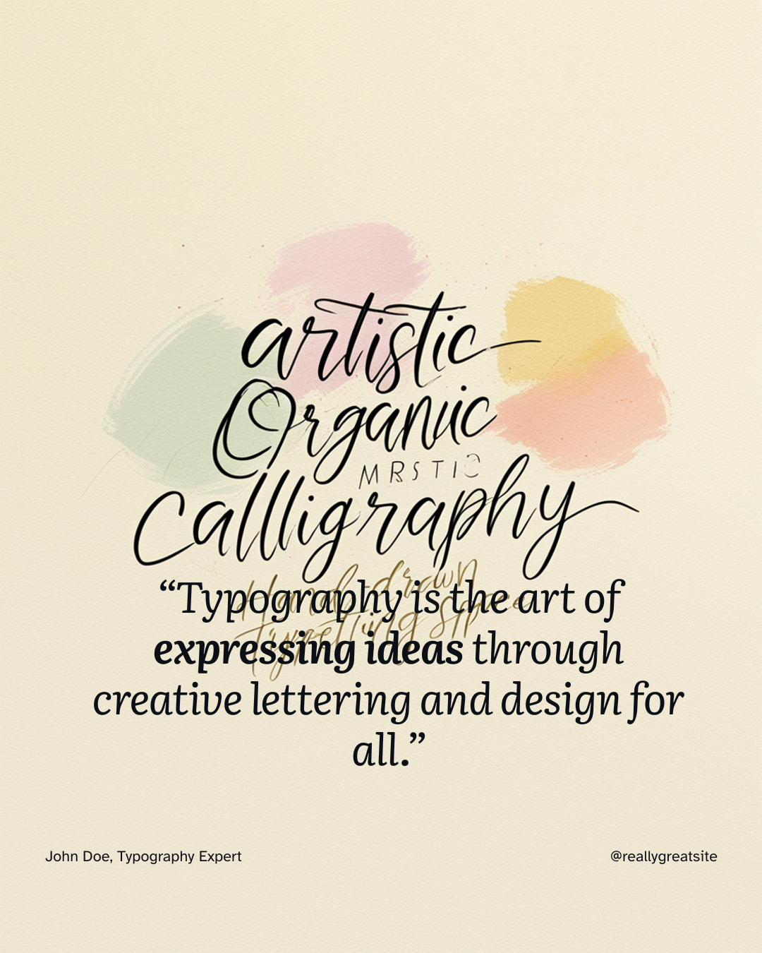
A typography logo design(often called a wordmark or logotype) uses letters, words, or a full brand name as its primary visual identity—without relying on an icon or graphic symbol. Companies like Google, Coca-Cola, Visa, and Netflix rely entirely on text-based logos to build global recognition.
A successful typography logo depends on font selection, custom kerning, visual hierarchy, and color theory to shape brand perception. This comprehensive guide details how to design a wordmark, choose typefaces that align with your industry, avoid common spacing mistakes, and export production-ready vector files for web and print.
Key Takeaways: Typography Logo Design
- Core Mechanics: Wordmark logos rely on font classification, letterform weight, kerning, and negative space rather than graphic symbols.
- Modern Web Standards: SVG is the primary file format for web headers and UI design, ensuring crisp display on retina screens and fast load times.
- Precision Kerning: Spacing between individual letter pairs (such as
A-VorO-O) must be adjusted visually rather than relying on default font settings. - Font Licensing: Commercial branding requires proper desktop and web-font licensing to avoid legal liability.
1. What Makes a Strong Typography Logo?
A strong text-based logo communicates brand personality instantly while ensuring the company name remains clear and legible across all physical and digital touchpoints.
                      [ Typography Logo Foundations ]
                                     |
    +--------------------------------+--------------------------------+
    |                                |                                |
[ Letterform Geometry ]      [ Visual Hierarchy ]           [ Spatial Balance ]
  - Stroke Weight              - Primary Name Dominance       - Custom Kerning
  - Serif vs. Sans-Serif       - Subdued Tagline Weight       - Negative Space Ratio
How Letterforms Communicate Brand Personality
Every letterform sends a subconscious message before a buyer reads the actual word:
- Rounded Letterforms: Feel friendly, soft, and approachable.
- Sharp, Angular Geometry: Signals innovation, technical precision, or modern aggression.
- High-Contrast Serif Strokes: Convey elegance, luxury, and editorial refinement.
- Thick, Heavy Weights: Project strength, reliability, and industrial stability.
When to Choose a Wordmark Over an Icon
A pure typography logo is ideal when:
- Your company name is short (1 to 3 words) and easy to pronounce.
- You want to build direct brand-name recognition quickly without training buyers to associate a symbol with your business.
- You need a versatile logo that scales seamlessly across minimal spaces (e.g., website headers, mobile app footers, or product packaging).
2. Selecting Typefaces by Industry & Style
Matching font selection to your specific industry ensures your visual mark resonates with your target audience.
| Font Classification | Visual Characteristics | Best Industry Fit | Example Typefaces |
| Geometric Sans-Serif | Clean lines, circular curves, uniform stroke thickness. | Tech, Software, Startups, Modern Retail | Inter, Futura, Montserrat, Proxima Nova |
| Classic / High-Contrast Serif | Decorative end strokes, varying thick-to-thin stroke ratios. | Law, Finance, Luxury Fashion, Publishing | Baskerville, Bodoni, Garamond, Playfair Display |
| Monospaced / Technical | Equal horizontal character width, industrial feel. | Developer Tools, Cyber Security, Architecture | Space Mono, JetBrains Mono, Fira Code |
| Custom Script / Calligraphy | Fluid, connecting letterforms mimicking hand lettering. | Artisanal Goods, Bakeries, Beauty, Lifestyle | Arizonia, Great Vibes, Custom Lettering |
3. Advanced Typographic Principles: Spacing, Kerning, & Hierarchy
Default font spacing is designed for body paragraphs, not logos. Designing a professional wordmark requires manual typographic refinement.
Understanding Kerning vs. Tracking
- Tracking: The uniform adjustment of space across an entire word or phrase. Increasing tracking (loosening space) across all-caps text creates a clean, high-end, luxury aesthetic.
- Kerning: The selective adjustment of space between two specific adjacent letters.
Incorrect Default Kerning:    V   A   L   U   E  (Uneven gaps around V and A)
Corrected Custom Kerning:     V A L U E          (Balanced negative space)
Professional Kerning Rules
- Straight Pairings (
I-I,H-N): Require the most horizontal space between them. - Straight-to-Curved Pairings (
H-O,I-C): Require moderate spacing. - Curved Pairings (
O-O,C-O): Require tighter kerning. Because curved edges create natural negative space at the top and bottom, placing them far apart makes them look visually disconnected. - Diagonal Angles (
A-V,W-Y): Require tight, overlapping kerning to eliminate large empty gaps.
Establishing Visual Hierarchy
When a logo includes a sub-headline, location, or tagline:
- Primary Name Dominance: Make the primary brand name noticeably larger or bolder than secondary text.
- Weight Contrast: Pair a Bold / Heavy brand name with a Light / Regular tagline.
- Case Contrast: Try using uppercase letters with wide tracking for taglines underneath a title-case brand name.
4. Testing Scalability and Vector Formats
A professional logo must adapt to various media sizes without losing clarity or distorting visual balance.
Responsive Display Benchmarks
| Display Target | Target Dimensions | Recommended Format | Key Design Consideration |
| Favicon / App Icon | 16×16 px to 32×32 px | SVG or PNG | Use a simplified single-letter monogram (e.g., Netflix’s “N”). |
| Website Header | 150×40 px to 250×60 px | SVG | Use responsive inline SVG code for retina clarity and zero pixelation. |
| Social Media Profile | 400×400 px (1:1 Ratio) | PNG | Ensure generous negative space padding around the text edges. |
| Commercial Print | Variable (Vector) | PDF / AI / EPS | Ensure colors are defined in CMYK color profiles rather than RGB. |
5. File Formats & Production Handoff
Exporting the correct file types ensures your logo renders sharply across all digital platforms and print applications.
                  [ Master Logo Export Package ]
                                 |
    +----------------------------+----------------------------+
    |                                                         |
[ Digital / Web Assets ]                              [ Commercial Print ]
  - SVG (Scalable Vector for Web)                       - PDF (Vector Master File)
  - PNG (Transparent Background Raster)                 - EPS / AI (Editable Print Source)
  - Color Mode: RGB                                     - Color Mode: CMYK
Essential File Formats Explained
- SVG (Scalable Vector Graphics): The standard for web design. Scalable to any screen resolution without quality loss, lightweight, and supports CSS styling.
- PNG (Portable Network Graphics): A raster image format supporting transparent backgrounds. Ideal for social media posts, email signatures, and slide decks.
- PDF / AI / EPS: Vector master formats used by print shops, embroidery machinery, and commercial sign makers. Preserves exact vector paths and CMYK print color profiles.
6. Commercial Font Licensing & Compliance
Before publishing a typography logo, verify that you hold the legal rights to use the underlying typeface for commercial branding.
- Desktop License: Allows you to install the font on a computer to design vector graphics, print materials, and static images.
- Webfont License: Authorizes embedding the font file into a website code via
@font-face. - Commercial vs. Personal Free Fonts: Free font downloads (e.g., from Google Fonts or DaFont) often allow personal desktop use, but commercial brand usage may require purchasing a commercial license from the type foundry.
Frequently Asked Questions (FAQ)
What is the difference between a wordmark and a lettermark logo?
A wordmark spells out the full company name (e.g., Google, eBay, Coca-Cola). A lettermark uses a stylized version of the company’s initials or acronym (e.g., IBM, HBO, CNN). Both rely entirely on typography rather than visual icons.
Why is SVG preferred over PNG for web headers?
SVG files are resolution-independent vector graphics, meaning they display with perfect sharpness on 4K and Retina mobile displays without increasing file size. PNGs are rasterized images made of pixels, which can appear blurry when scaled up on high-density screens.
How do I ensure my typography logo remains readable at small sizes?
Avoid fonts with extremely thin hairlines or complex script flourishes. Test your design by scaling it down to a 32×32 pixel thumbnail. If the letterforms blur together, increase letter spacing (tracking) or select a heavier font weight.
Can I trademark a logo made from a standard font?
Yes, provided you have properly licensed the font for commercial use and the overall logo design (combining the font choice, unique kerning, color arrangement, and industry usage) creates a distinct visual mark that differentiates your business from competitors.
Glossary: Key Terms
- Typography – The art and technique of arranging type to make written language legible and visually appealing.
- Wordmark – A logo made entirely from text, usually the brand name, without any icons or images.
- Serif – Small lines or strokes attached to the ends of letters in certain fonts, giving a traditional look.
- Sans Serif – Fonts that don’t have the little end lines (serifs), making them look cleaner and more modern.
- Script Font – A font style that mimics cursive handwriting, with connecting letters.
- Calligraphy – Decorative handwriting or handwritten lettering with artistic flourishes.
- Handwritten Font – Fonts designed to look like they were written by hand, usually casual and informal.
- Display Font – Bold, attention-grabbing fonts used for short text like logos or headlines.
- Decorative Font – Highly stylized fonts meant for specific, creative uses (not for long text).
- Custom Typeface – A font designed specifically for one brand, not available for public use.
- Font Pairing – The practice of combining two different fonts that complement each other in design.
- Font Weight – The thickness of the characters in a font (e.g., bold, regular, light).
- Letter Spacing – The space between individual letters in a word.
- Kerning – Adjusting the space between specific pairs of letters for better visual balance.
- Readability – How easy it is to read the text at a glance.
- Recognition – The ability for people to instantly identify a logo or brand.
- Geometric Font – Fonts based on simple shapes like circles and straight lines, often used for a modern look.
- License – Legal permission to use a font for specific purposes (personal, commercial, etc.).
- Minimalism – A design style focused on simplicity, clarity, and using only essential elements.
- App Icon – A small, simplified version of a logo used for mobile or desktop applications.